Design
Laneige: User-Centered Logo & Packaging Redesign
2026
- Medium
- Adobe Illustrator, Adobe Dimension
- Year
- 2026
Description
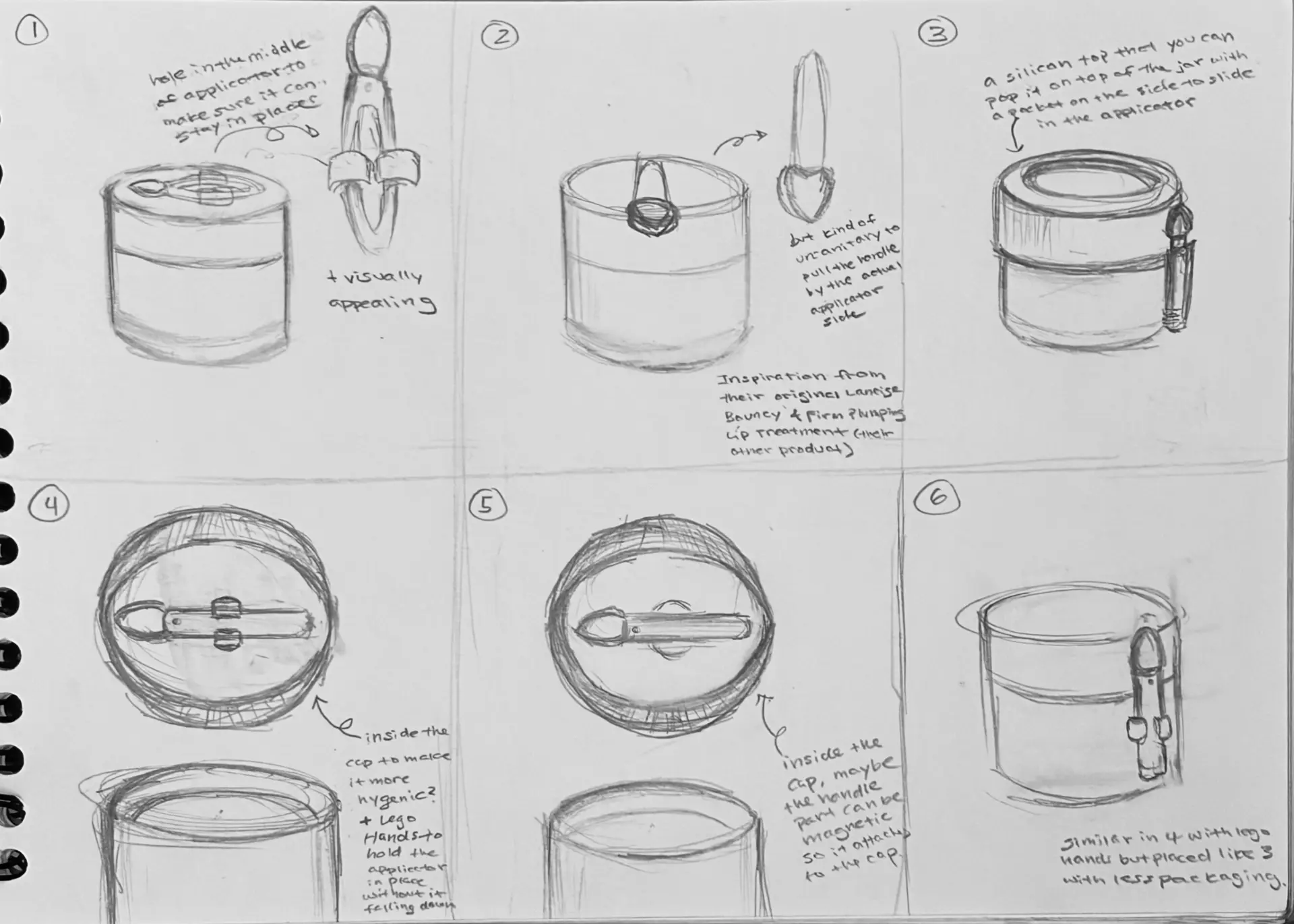
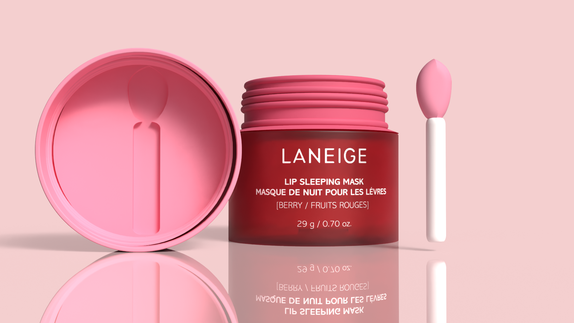
This project reimagines Laneige's Lip Sleeping Mask through a user-centered lens, starting from a simple pain point: the included spatula is small, unattached, and easy to lose. Once it's gone, people fall back on applying the product with their fingers, which undoes the hygiene the applicator was there for in the first place.
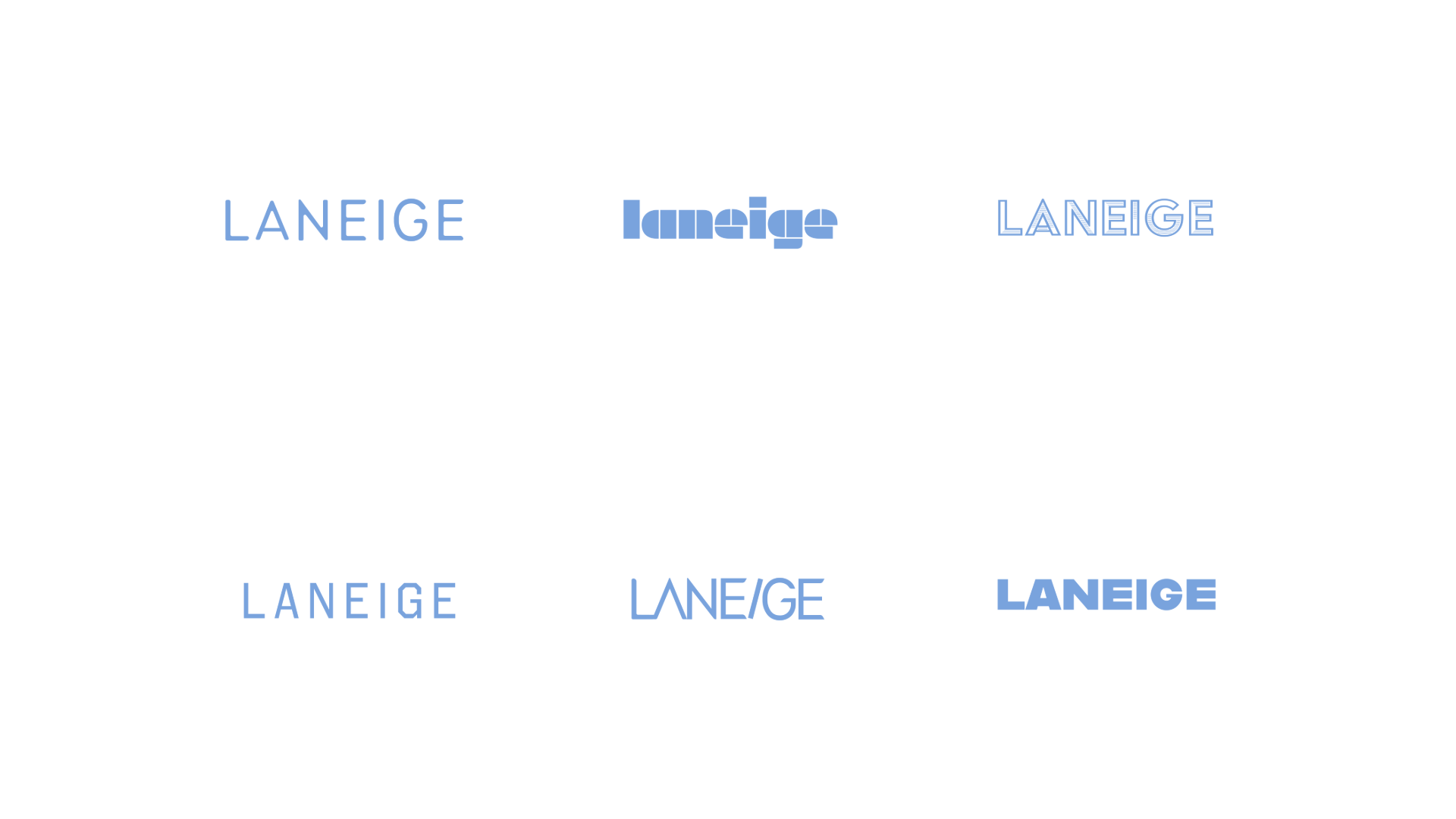
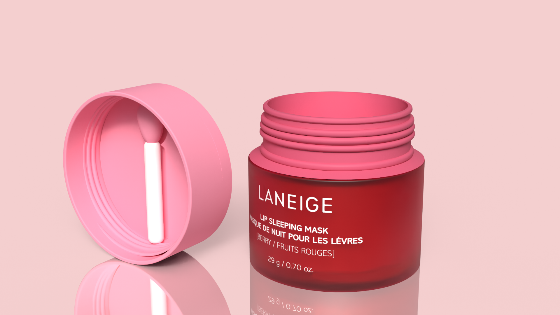
I kept what already works about the brand: the color-coded jars, the rounded silhouette, the premium feel in the hand. What I changed was the relationship between the jar and its applicator. The redesigned spatula docks directly into the lid, so it has a fixed home instead of floating loose in a bag or drawer. I also softened the logo mark to echo the round shape of the jar, so the branding and the packaging read as one designed system rather than two separate decisions.
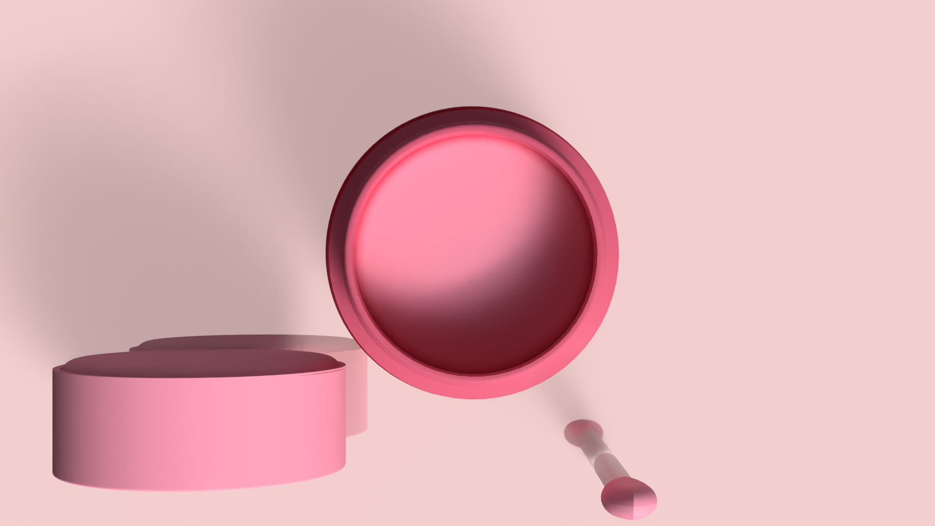
I built out the concept through logo sketches, packaging sketches, and final 3D renders in Adobe Illustrator and Adobe Dimension, grounding each design choice in research on who actually uses this product and how (mostly half-asleep, at night, in dim light, needing something that works one-handed).